Did you know that consumers are more likely to trust your brand more if your website is aesthetically pleasing, as well as user-friendly, when they first land on the homepage?
Think about the last time you visited a website that had broken links, or misplaced, poorly designed graphics. What was your initial thought? Did you think twice before investing in a product or service from that website?
Chances are, you probably did, because first impressions matter.
Your website is an extension of your brand/business online, and it should be treated accordingly. Here are ten things you might be doing completely wrong on your current website that may be causing you to miss out on converting potential clients to brand loyalists.
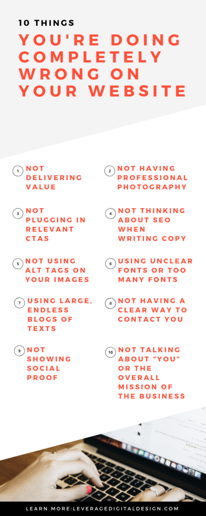
Not delivering value
While your website obviously needs to be a hub that sells your business and services to those who visit it, it also has to be a place that delivers value.
Are most of the pages on your website nothing but a long sales pitch? You might be driving away people who are not yet convinced that they should trust you or buy from you.
Let’s say you’re in the health and wellness industry. It’s great if your website already highlights why someone should work with you, and what makes your specific product and/or service so great, but wouldn’t it be even better if you had informational blog posts and videos that included healthy recipes, workout routines, and fitness tips? Maybe even an optional email opt-in that enables the delivery of all of this great information right to someone’s inbox.
Filling your website with content that benefits others (for free!), and content that your target audience might find valuable, will keep them coming back for more, and eventually have them interested in becoming a paying customer.
Not plugging in relevant CTAs

All of that being said, it’s important to have a healthy balance of value and conversion points on your website. Don’t just fill up pages with text and photos; ensure that, where appropriate, CTAs are inserted throughout your copy on various pages.
For example, let’s say you’re in the hotel industry and you’ve written a content-rich blog post about some of the best hikes in the USA. Wouldn’t it be a great opportunity to throw in a CTA that highlights your current room deal, close to some of these hikes? There’s a good chance that someone is going to click on that CTA and potentially book a room if they've shown interest in the blog post.
Think about your different service pages on your website. Is there places where you can break up copy with a CTA graphics that links to those exact service you offer? Most likely!
At the end, and even in the middle, of all of our blog posts, we always include a CTA that links to our completely free brand audit:
This ensures that anyone who is reading our blog who might be interested in digital marketing and branding for their business has the chance to get redirected to the brand audit. This also ensures that we are a) delivering value through our blog posts and b) implementing conversion points where appropriate all at the same time.
(PRO TIP: your CTA graphics should always pop. Make sure they stand out with their own distinct accent color).
Not having professional photography

In a sea of websites, you want to make sure you’re doing everything you can to stand out from your competitors. Remember, prospective customers are more likely to trust your brand if your website is aesthetically pleasing, so ditch the dark iPhone pictures and start thinking about the type of photos you’re using.
The investment you should make in photography for your website (PRO TIP: these photos can be used for other marketing uses such as on your social channels, in your emails, etc.) directly relates to what type business you are running.
If you have an e-commerce store, it’s essential to invest in a photoshoot so that you can show your audience exactly what it is you’re selling. Professional, clear photos of your merchandise is a must if you want to close sales!
Restaurants and hotels would benefit from photography on their websites as well. No one wants to book a room without first seeing photos of it, and having some snapshots on your booking pages is a great way to introduce and sell them. Think about it: if your competitor is lacking photos of their own hotel rooms, there’s a higher chance people are going to want to book with you instead.
Additionally, you have a better chance of scoring dinner reservations when your website shows off your gourmet dishes and high-vibe space. There are some cases where stock photo can be used, so make sure you’re aware of the different websites where you can pull free images for your website as well.
Not thinking about SEO when writing the copy
When creating the copy for your website, it’s important to be thinking about search engine optimization, and what sort of keywords you’re trying to rank for online. The ultimate goal when it comes to your website should be ranking above your various competitors, so that when someone searches for keywords related to your industry, you pop up on the first page of Google (ideally).
Don’t just blindly type up what you think should be on your website. Do some research and make sure you are naturally plugging in relevant words by diving into keyword research. Think about your audience and what they are searching for. Once you have that nailed down, craft your copy, and your various landing pages, around these searchable words and terms (or, we could do the work for you!).
Not using alt tags on your images
Another component of SEO. Did you know that your images can also help you rank well on Google? Each and every image that you publish on your website can be “tagged” with your relevant keywords.
For example, if you’ve written a blog about email marketing, you could tag your header image as “email-marketing-advice-blog.” If you have a landing page titled “Website Design”, your images could be tagged as something like “website-design” or more specific tags such as “website-design-services-california”.
Using unclear fonts or too many fonts

Your website should be user-friendly all the way down to which type of fonts you choose to use and display.
First, make sure that any of the fonts you do choose are readable on both desktop and mobile iterations of your website. No one likes squinting to try and read something, or feel like they can’t read anything at all because the font is too big and cuts off the page (PRO TIP: you also want to consider line length when it comes to how your copy is going to be displayed on your website).
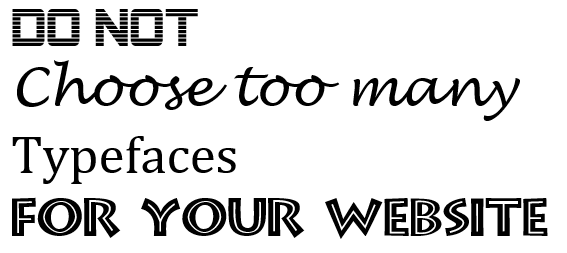
Photo Credit: onextrapixel
Secondly, don’t use a multitude of different fonts either. You still want to be thinking about your brand guidelines and how that translates to your website look and feel. Using five different fonts that are in no way similar to one another is only going to harm your brand recognition and destroy any chances of consistency.
(PRO TIP: you want to think of contrast when you’re building out you website design and fonts as well. Will black font really look good on a red background?).
Using large, endless blocks of text
Having an endless amount of text on your website pages makes for an unpleasant user experience. People like to skim what they are reading and still be able to get all of the relevant information they might need. Ditch the endless blocks of text and make sure you’re implementing:
- Bullet points
- Short digestible sentences
- Headers where applicable (H1, H2, H3, etc.),
- Bolded sentences for emphasize
- Relevant photos to break up text
If you can make your pages easy and enjoyable to read, people are going to stay on your website longer (which is great for your bounce rate), and they’re actually going to be able to retain that information more so then they would have if everything was presented to them in large blocks of text!
Not having a clear way to contact you or correct business hours
Having correct information on your website is a necessity.
Is there a clear way for people to contact you? Is your email and phone number displayed in a place that people can easily access? Are your hours of business clearly stated? If you answered no to any of these questions, it’s time to change that.
Not showing social proof
Testimonials are powerful. Showcasing who you’ve worked with in the past, and what they have to say about your business is a great tactic to gain the trust of prospective clients, and secure more business. Your website should serve as a hub where you can display tidbits of social proof that show everyone else that you have multiple happy clients.
Don’t have any testimonials? Talk to people you’ve worked with and ask them if they can give you one. Slowly start to collect these as you work with more people, and make sure you’re constantly updating your website with them. These are important to building authority in your industry, and great assets to have.
Not talking about “you” or the overall mission of the business

Finally, make sure that your website is infused with your own personality and story. People connect to authenticity. Along with talking about your product and services, make sure you’re telling them about yourself in a way that they can resonate with.
If you’re not the face of your business, make sure you’re still communicating the overall story of the various people that make up the business. What makes everything tick? What is the overall mission and vision of the business? What are the values the business holds dear? Think of these elements on your website like a virtual handshake. The person reading these key points is going to slowly get to know you, eventually trust your business, and hopefully want to work with you.
You can’t beat something that has the element of the human touch.
Not sure where to start when it comes to making your website top notch? Don’t panic. We’re here to help: Leverage us today.